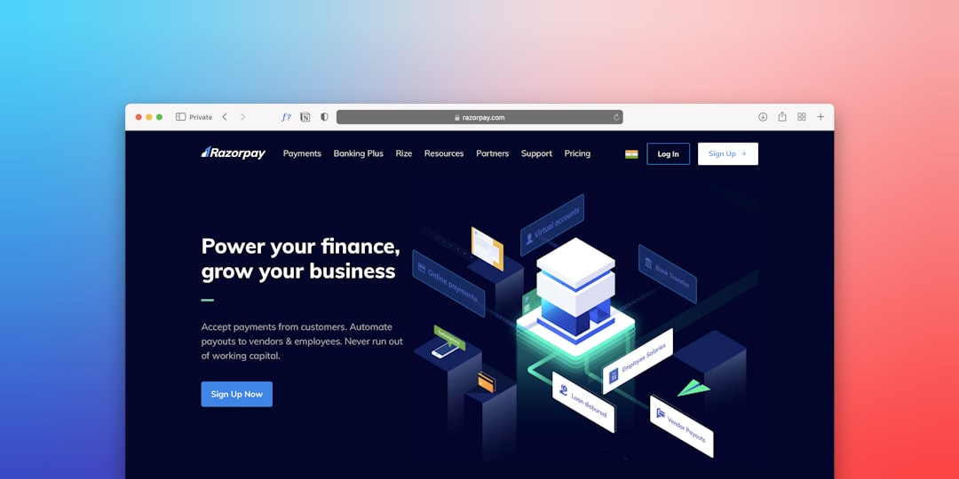
A landing page is a single web page built to get one clear action from one clear type of visitor. That action could be a sale, sign-up, download, demo request, booking, or quote request. The page has one job. No wandering. No “maybe click here too.” Just a simple path from interest to action.
TLDR: A landing page is a focused page made for a specific campaign, offer, or audience. For example, a gym might send ad traffic to a page offering “7 days free,” not to its busy homepage. If 1,000 people visit and 120 sign up, the landing page has a 12% conversion rate. A good page makes the offer obvious, removes friction, and asks for one next step.
So, what is a landing page?
A landing page is where someone “lands” after clicking a link. That link may come from an ad, email, social post, search result, QR code, or even a text message.
But not every page people land on is a proper landing page.
A regular web page may have many goals. It may show your story, services, blog, team, menu, prices, and ten links to other places. Useful? Sure. Focused? Not really.
A landing page is different. It is built around one offer and one main call to action. That call to action is often called a CTA. That is the button or form asking people to do the thing.
Examples include:
- “Start your free trial”
- “Book a demo”
- “Download the guide”
- “Get my quote”
- “Reserve my seat”
Think of it like a tiny salesperson. A good one does not ramble. It greets the visitor, explains the value, answers doubts, and points to the next step.
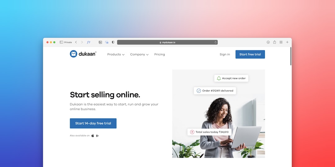
How a landing page works
A landing page usually starts with traffic. Someone sees a message somewhere. They click because that message sounds useful.
Then the landing page must keep the promise.
If an ad says, “Get 30% off running shoes,” the page should show running shoes and that 30% offer right away. Not hiking boots. Not a brand story from 1998. It drives me crazy when I click an offer and then have to hunt for it like it is hiding behind a sofa.
The basic flow looks like this:
- Visitor sees a message. This could be an ad, email, search result, or social post.
- Visitor clicks. They expect a specific thing.
- The landing page matches that expectation. Same offer. Same tone. Same promise.
- The page explains the value. Fast. Clear. No fluff.
- The visitor takes action. They fill a form, buy, book, or sign up.
- You measure the result. You track visits, clicks, sign-ups, sales, and cost.
That last part matters. A landing page is not just a pretty poster. It is a testable sales tool. You can see what works and what flops.
Landing page vs homepage
Your homepage is like your front desk. It welcomes all kinds of people. New customers. Job seekers. Partners. Curious browsers. Existing clients. Your uncle who still does not know what your company does.
A landing page is more like a private booth at a fair. It serves one person with one need.
Here is the simple split:
- Homepage: many audiences, many links, many goals.
- Landing page: one audience, one offer, one goal.
That focus is the magic. Fewer choices often mean more action. When people face too many options, they pause. Then they leave. Rude, but true.
What makes a landing page effective?
An effective landing page is clear, fast, and believable. It does not try to impress people with fancy words. It helps them decide.
Here are the key parts.
1. A clear headline
The headline should say what the offer is and why it matters. Fast.
Weak headline: “Better Solutions for Modern Teams”
Better headline: “Plan your team’s weekly schedule in 10 minutes”
The second one tells people what they get. It feels real. It is not wearing a business suit made of fog.
2. A strong hero section
The hero section is the top area of the page. People see it first. It should include:
- A benefit-focused headline
- A short supporting line
- A clear CTA button
- A helpful image, product shot, or visual proof

3. One main CTA
Do not ask for five things at once. Pick the action you want most.
If the goal is demo bookings, the main button should say “Book a demo”. Not “Learn more,” “Explore,” “Contact,” and “See our story” all fighting in the same row.
Your CTA should be specific. “Submit” is boring. It also feels like paperwork. Try:
- “Get my free checklist”
- “Start my trial”
- “Show me the pricing”
- “Save my seat”
4. Proof that makes people relax
People are skeptical. Good. The internet taught them that.
Add proof to lower doubt. Use items like:
- Customer reviews
- Star ratings
- Logo strips
- Before and after examples
- Case study numbers
- Security badges
- Money-back guarantees
Specific proof beats vague praise. “Loved by busy parents” is fine. “4,800 parents used it to plan school lunches last month” is stronger.
5. A short, painless form
Forms can kill conversions. Ask only for what you need.
If someone wants a free PDF, you probably do not need their company size, phone number, favorite snack, and shoe size. Honestly, it feels like some forms are built to make people quit. If a form takes 38 seconds instead of 11, expect fewer completions.
For early-stage offers, name and email may be enough. For sales calls, you may need more. Still, keep it lean.
6. Fast load speed
Slow pages lose people. No one wants to stare at a spinning icon while their motivation leaks away.
Aim for a page that loads in about 2 seconds if possible. Big images, heavy scripts, and messy code can slow things down. Compress images. Remove junk. Test on mobile.
7. Mobile-friendly design
Many visitors will arrive on a phone. Your page needs to work with thumbs, tiny screens, and short attention spans.
Make buttons easy to tap. Keep text readable. Avoid giant forms. Check that nothing breaks or slides off the screen like it gave up.
Common landing page types
Landing pages come in several flavors. Each has a job.
- Lead capture page: collects emails or contact details.
- Click-through page: warms people up before sending them to buy.
- Sales page: explains and sells a product or service.
- Event page: gets people to register for a webinar, class, or meetup.
- App download page: pushes people to install an app.
- Thank-you page: confirms the action and suggests the next step.

How to measure success
The main number is the conversion rate. This shows the percentage of visitors who take the desired action.
Use this formula:
Conversion rate = conversions ÷ visitors × 100
If 500 people visit and 50 sign up, your conversion rate is 10%.
Other useful numbers include:
- Bounce rate: how many people leave without doing anything.
- Cost per lead: how much you pay for each sign-up or inquiry.
- Click-through rate: how many people click your CTA.
- Form completion rate: how many people start and finish the form.
- Revenue per visitor: how much each visit is worth on average.
Do not guess. Test. Change one thing at a time. Try a new headline. Try a shorter form. Try a different button label. Small changes can have a big effect.
Simple checklist for a great landing page
- One audience
- One offer
- One main CTA
- Clear headline
- Short copy
- Visible benefits
- Strong proof
- Fast load time
- Mobile-friendly layout
- Easy form
- Tracking set up
Final takeaway
A landing page is not just another page on your site. It is a focused tool that turns interest into action. The best ones are simple, quick, and useful. They match the promise that brought the visitor there.
When in doubt, cut the clutter. Make the offer clear. Make the button obvious. Then test what happens. Your visitors should not need a map, a coffee, and emotional support to figure out what to do next.