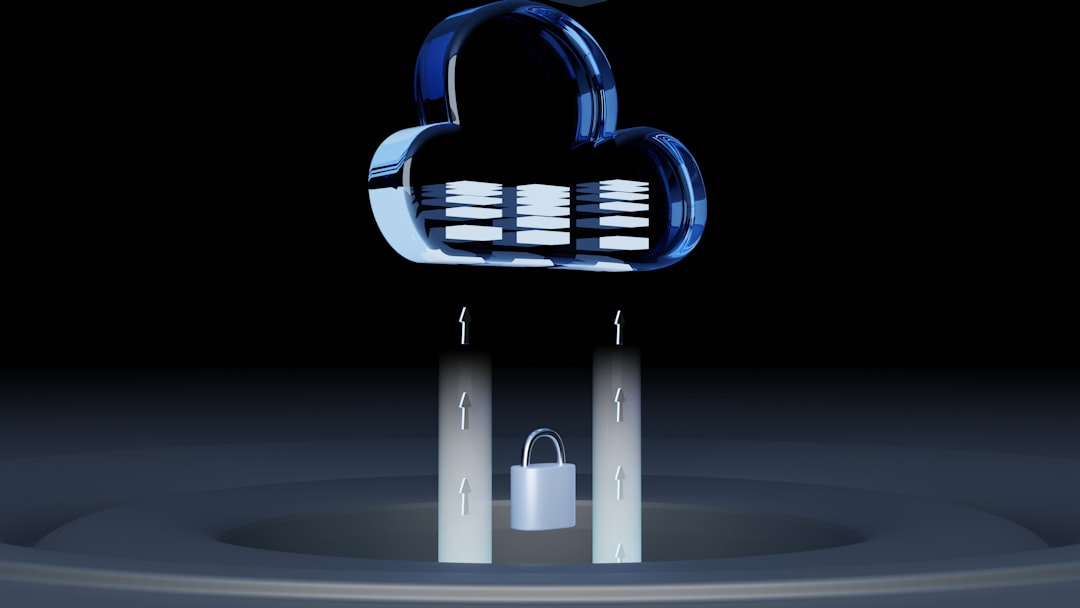
Creating a powerful logo for a cybersecurity or IT services company is more than just a design task — it’s about communicating trust, security, and innovation in a single image. In an industry driven by data protection, digital infrastructure, and cutting-edge technology, logos need to visually express both technical expertise and reliability.
TLDR
A great cybersecurity or IT logo should reflect security, innovation, and professionalism. This article explores 12 creative logo ideas tailored to businesses in the tech space. From shield emblems to minimal circuit motifs, each idea is described with branding insights and visual tips. Also included is a short FAQ on color schemes, typography, and choosing the right brand image.
1. Shield-Based Logos
Symbolism: Protection, defense, and safety.
One of the most common and effective motifs in cybersecurity branding, shield logos offer a clear metaphor for protection against threats. Designed with clean lines and often symmetrical shapes, these icons instill a sense of trust in the company’s ability to safeguard data and systems.
To avoid cliché, these can be modernized with abstract art styles, circuit patterns, or minimalist fills within the shield to create uniqueness.

2. Minimalist Circuit Boards
Symbolism: Digital foundation, electronic networks, connectivity.
Using lines and nodes inspired by circuit boards can add a tech-forward aesthetic while remaining minimalistic. By simplifying the design into a network of lines or a stylized microchip, businesses can convey their deep-rooted expertise in IT infrastructure.
These logos work well in monochrome and translate easily to app icons, stamps, or embroidery.
3. Lock and Key Elements
Symbolism: Encryption, access control, safety.
Locks (or digital key icons) immediately draw the viewer’s mind to security. These can be creatively adapted, such as a keyhole inside a cloud to represent cloud protection, or a lock integrated into a circuit pattern to show technical rigor.
Consider using subtle gradients or geometric shadowing to keep the design modern.
4. Padlock with Binary Code
Symbolism: Secure data, binary protection.
Binary code is the DNA of the digital world. Incorporating the 1s and 0s subtly in a design — such as within a lock silhouette — reinforces the company’s tech foundation while reaffirming a focus on secure data management.
It’s essential to not overcomplicate; subtle binary texture can enhance brand identity without overwhelming the viewer.
5. Globe with Network Lines
Symbolism: Global reach, digital interconnectedness.
For IT companies offering services worldwide or working in cloud management, a networked globe layered with connection points or orbit lines portrays an international presence and digital savvy.
The globe can be presented in an outline or a more stylized digital version, using dots and lines to form a mesh.

6. Fingerprint or Biometric Motifs
Symbolism: Personal data protection, biometric ID.
Using a stylized fingerprint, iris scan, or handprint in the logo suggests cutting-edge protection methodologies involving user authentication. Infusing a biometric motif into the letterforms or shapes in the logo conveys a modern, forward-thinking brand personality.
These are ideal for companies specializing in authentication, mobile security, or enterprise identity tools.
7. AI or Brain-Inspired Graphics
Symbolism: Intelligence, automation, machine learning.
As more cybersecurity tools incorporate artificial intelligence, using a subtle brain pattern or nodes forming a neural structure nods to this innovative edge. The icon can be shaped out of circuits or include motion lines for a futuristic feel.
This is suitable for AI-based threat detection firms or data analysis services.
8. Negative Space Technology Icons
Symbolism: Clever design, simplicity, hidden depth.
Logos that use negative space to shape subtle tech symbols (like USB icons, microchips, or locks) offer a sophisticated brand feel. These challenge the viewer to look deeper, reflecting how cybersecurity often works invisibly in the background.
The key is to keep the contrast strong and the design tight for clarity at different scales.
9. Abstract Data Flow Waves
Symbolism: Movement of information, cloud computing, seamless integration.
Swooping lines or layered wave patterns can represent the handling of large-scale, fast-moving data. These make for elegant and fluid designs, especially effective in cloud, SaaS, or virtual desktop service logos.
Paired with soothing tech blues or purples, they convey calmness and reliability amid complexity.
10. Typography-Centric Monograms
Symbolism: Authority, clarity, focus on brand name.
If your brand name is bulky or heavily relied upon, a strong typographic mark using initials in a high-tech or geometric font might be the best route. Adding small embellishments like a circuit line integrated into a letter can be a helpful touch.
This approach balances originality with a clean and modern look and is perfect for startups and rebranding efforts.
11. Cyber Mask or Facial Guard Iconography
Symbolism: Cyber-warrior theme, anonymity, cybersecurity defense.
Using a stylized mask or facial shield shape can give the impression of readiness and vigilance, reflecting the stealthy side of IT security. This works especially well for ethical hacking firms, threat detection services, or incident response squads.
A minimalist helmet or robotic face also adds intensity without seeming aggressive.
12. Cloud-Shield Hybrids
Symbolism: Secure cloud services, hybrid security platforms.
Blending a cloud with a shield reinforces both cloud access and protective measures, creating clarity about the company’s expertise. Shadowing, outlines, and gradient color transitions help to emphasize trust while suggesting cloud dynamism.

Conclusion
Choosing the right logo for a cybersecurity or IT brand is a critical step in building long-term credibility, especially when the brand must attract clients based on trust and technical ability. Whether opting for minimalism or symbolism, the key is to express not just what the company does but also why it exists — to protect, enable, and enhance the digital world. With thousands of tech companies competing in the market, a uniquely crafted visual identity can make all the difference.
FAQ
- What colors work best for cybersecurity logos?
Blues and greys are common due to their connotations with trust and professionalism. Accent colors like orange or green can signify innovation and safety. - What fonts are recommended for IT services branding?
Geometric sans-serif fonts like Roboto, Avenir, and Helvetica Neue work well. For a futuristic appeal, try lightweight tech-inspired fonts with clear spacing. - Should I include a slogan in the logo design?
It depends on the context. For social media icons or app logos, avoid slogans. For horizontal web headers and stationary, a tagline like “Secure Your Future” or “Data. Trust. Defense.” might add clarity. - Should the logo be abstract or literal?
Abstract logos often work better for long-term branding, offering flexibility across platforms. Literal icons work well when the brand is new and needs instant recognition. - How detailed should the logo be?
Keep it simple and scalable. Overly complex logos don’t translate well across multiple mediums, such as mobile screens or merchandise.
