In today’s world of direct-to-consumer (DTC) sales and subscription-based services, branding has become one of the most critical pillars for a business’s success. At the center of this branding effort is the logo. Whether it be artisan coffee deliveries, skincare kits, meal prep packages, or monthly book boxes, a memorable logo can be the difference between blending in and standing out. For startups and entrepreneurs launching DTC kits or subscription boxes, crafting the right logo isn’t just an aesthetic concern—it’s a strategic move.
TLDR: The success of a DTC kit or subscription box heavily depends on brand identity, and a great logo is a massive part of that. This article dives into 12 creative and purposeful logo ideas tailored for these types of products, along with tips for designing a logo that resonates with your audience. You’ll also learn which visual styles work best for different industries, packaging types, and customer demographics. Plus, there’s a handy FAQ if you’re just starting your brand journey.
1. Minimalist Icons
One of the most popular logo trends for DTC kits and subscription boxes is the use of minimalist icons. These clean, simple designs offer elegance and memorability without overwhelming the visual landscape. Think of a solitary geometric object or a line-art representation of the product inside the box.
Example: A razor subscription box might use a single line-art illustration of a razor blade combined with clean sans-serif typography.
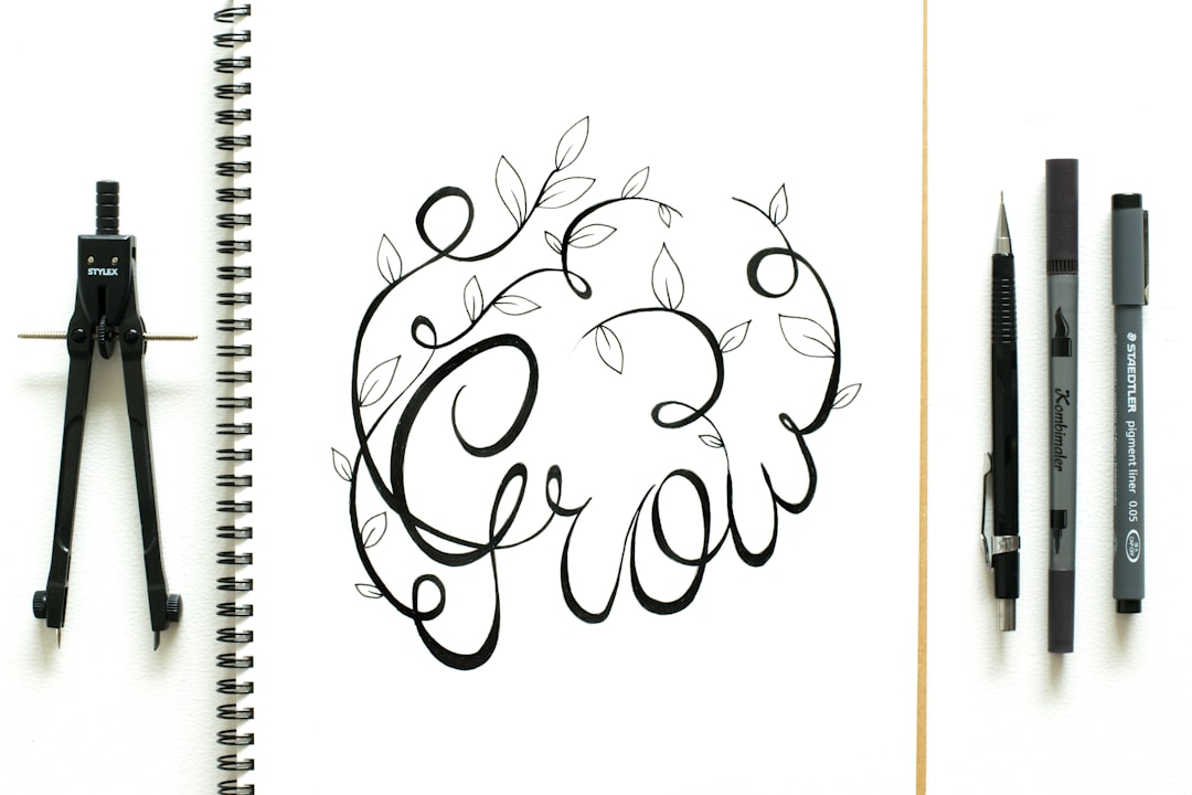
2. Hand-Drawn Illustrations
To convey a homegrown, artisanal, or handmade feel, hand-drawn elements are a powerful bet. These logos often provide a human and emotional touch, perfect for craft-oriented boxes such as art supplies, handmade food items, or limited edition stationery kits.
Pro tip: Pair this style with a slightly textured font to enhance the handcrafted impression.

3. Typography-First Logos
Sometimes, words do have enough power—especially when they’re well-designed. Typography-forward logos place a strong emphasis on the company name with custom lettering, unique font combinations, or even playful type distortions.
Best for: Book subscriptions, productivity kits, or curated paper goods, where the clean and confident text speaks for itself.
4. Vintage-Inspired Logos
Retro-style logos are great for evoking feelings of nostalgia and craftsmanship. Whether it’s a 1970s color palette or a 1950s diner theme, vintage logos work well for food kits, grooming boxes, or fashion DTC packages that lean on tradition or heritage.
Visual features: Oval badges, script fonts, grains, and classic serif lettering.
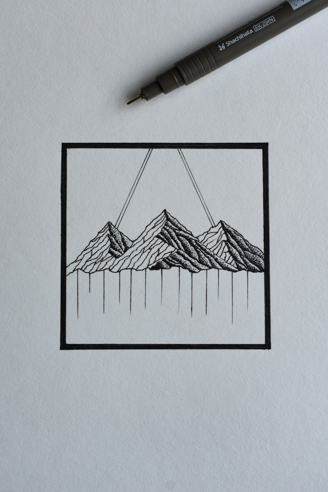
5. Nature-Based Imagery
Brands focused on sustainability or wellness often incorporate natural shapes: leaves, trees, mountains, waves, or even animal silhouettes. This design choice aligns messaging with visual cues that feel organic and calming.
Perfect for: Eco-friendly subscription boxes, organic food kits, outdoor survival kits, or herbal remedy boxes.

6. Negative Space Logos
Smart use of negative space can really wow potential customers. These logos typically hide shapes or icons within white space to create a feeling of discovery, which dovetails well with the “surprise and delight” character of many subscription boxes.
Example: A spice box logo that hides a spoon within the curve of a chili pepper shape.
7. Geometric Symbolism
Geometry adds a level of structure, balance, and logic to your design. Using circles, triangles, or other regular forms can give your logo a sense of order that appeals especially to boxes offering planning tools, organizational kits, or DIY project subscriptions.
Recommended color pairings: Monochrome or dual-tones with high contrast for a sleek look.
8. Playful Mascots
Nothing adds personality quite like a cute or quirky character. Mascots are especially popular for kid-oriented boxes, pet food kits, or snack subscriptions. If your target audience is more casual, family-oriented, or quirky, a mascot logo can work wonders by humanizing your brand.
Pro tip: The mascot should match your box’s core identity—don’t just add a face for the sake of it.
9. Abstract Forms
For modern, tech-driven, or futuristic brands, abstract logos provide a sense of sophistication and edge. These logos might use swirls, unique blobs, or hard angles to convey a cutting-edge identity.
Ideal for: High-tech gadgets, futuristic fitness gear, or scientific skincare boxes.
10. Badge + Banner Hybrid
This is where traditional meets modern. Think of classic emblem-style crests with banners at the top or bottom. It provides a sense of legacy and trustworthiness, often used for grooming kits, food curation boxes, or health supplements.
Design tip: Use symmetry and layered visuals to add authenticity.
11. Packaging-Inspired Logos
Using the literal shape of your box—or the way it opens—as part of the logo is a clever technique that links the experience of receiving your product directly to the visual brand.
Example: A mailer box that forms the negative space of the brand’s first letter.
12. Seasonal or Rotating Sub-Logos
Unique to subscription boxes is the value of surprise. Brands can create evolving logos that change colors, icons, or characters season to season while maintaining a consistent core. A rotating logo system builds anticipation and engagement for returning customers.
Best for: Apparel, lifestyle accessories, or trend-heavy products where freshness is key.
Final Thoughts
When designing a logo for a DTC kit or subscription box, the goal is to strike a balance between clarity, memorability, and emotional resonance. Whether you go playful or professional, abstract or literal, consistency is your friend. The logo often becomes the centerpiece of your packaging, email campaigns, and social posts—so take the time (or hire the right designer) to craft something that reflects your product’s soul.
FAQ
- Q: Should my subscription box logo include my brand name?
A: Typically, yes. Including your brand name helps with initial brand recognition. As your brand grows, you can lean into more symbol-based or minimalist versions. - Q: Can I use free logo makers for my subscription business?
A: You can, but be cautious. Many free tools offer generic templates that may compromise uniqueness. Custom design is ideal, though online makers are a decent starting point. - Q: How many versions of my logo should I have?
A: It’s a good idea to have at least three: full (with name and icon), icon-only, and a monochrome version for simplified applications like tape and labels. - Q: What file formats should I have my logo in?
A: Vector files like .AI, .EPS, or .SVG are best for scalability. You’ll also want .PNG and .JPG versions for web use. - Q: How important is color choice in my logo?
A: Incredibly important. Choose colors that reflect both your brand’s personality and your target audience’s expectations. Test your logo in both full-color and black-and-white scenarios.
