Thinking about launching a subscription box or direct-to-consumer kit? You’re in for a fun ride! But before you pack your first box, you’ll need a logo that stands out. Your logo is your brand’s face. It’s the first thing customers see. Let’s make it unforgettable.
TLDR:
Your logo should be simple, memorable, and match your product vibe. In this guide, you’ll get 12 creative logo ideas for subscription boxes and DTC kits. Each one has a unique spin to help you attract your ideal customer. Get ready to be inspired!
1. The Minimal Mark
Simple is powerful. A clean, black-and-white logo can look ultra-modern and chic. Think thin lines, sans-serif fonts, maybe just your initials. This style works well for beauty items, fashion kits, and wellness boxes.
Why it works: It’s timeless. It looks great on packaging, stickers, websites—you name it.
2. The Hand-Drawn Vibe
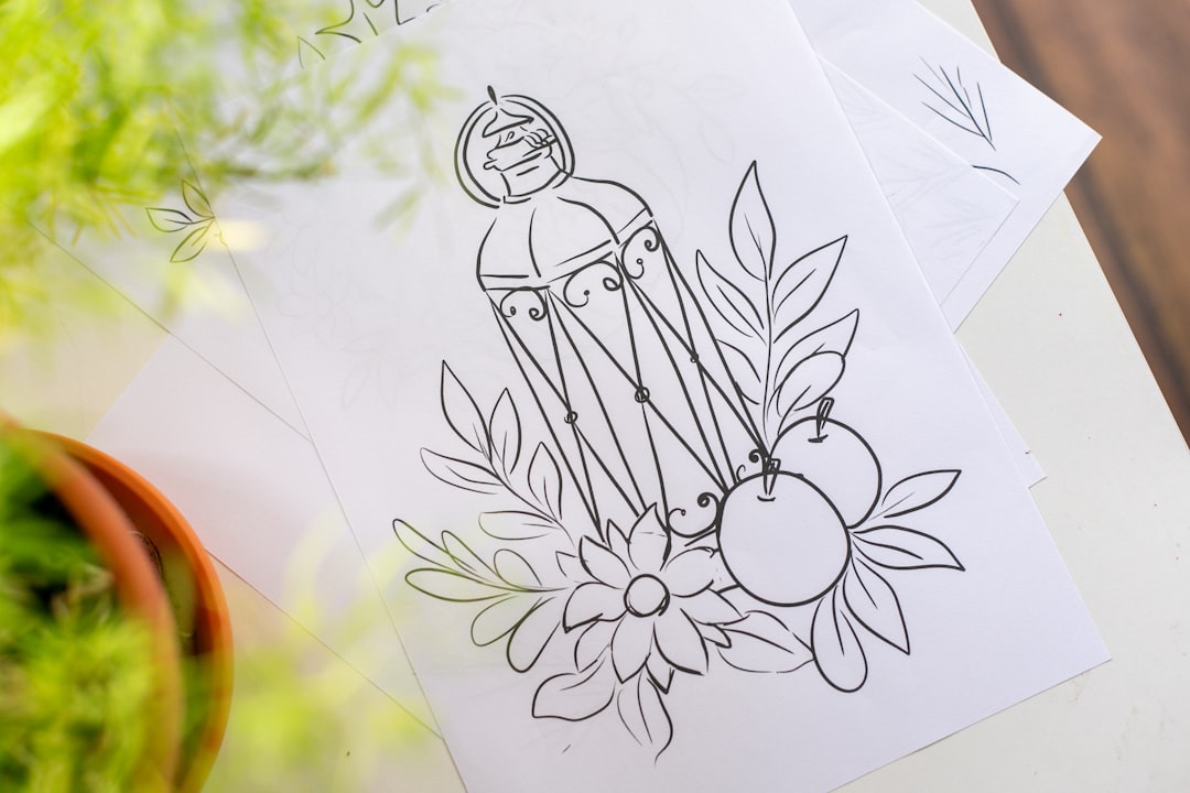
Hand-drawn elements bring a personal touch. Think sketchy lines, brushed fonts, or even a cute mascot.
This style is perfect for snack boxes, DIY craft kits, or wellness brands looking to feel more human.
Bonus tip: Add a little imperfection! Wobbly lines can be charming.

3. The Nature Feel
For eco-friendly boxes, plant-based kits, or wellness brands, nature-themed logos work wonders.
- Use earthy tones
- Incorporate leaves, trees, or sun icons
- Try lowercase fonts for a soft, gentle tone
Keep in mind: Balance detail with simplicity. You want the logo to scale well on small boxes.
4. The Bold Block
Think big letters, bold colors, and strong shapes. This logo is for brands that want to show power and confidence.
Perfect for tech kits, fitness boxes, or snack subscriptions targeting young adults.
Ideas: Try bold sans-serif fonts, square shapes or tightly packed lettering.
5. The Friendly Face
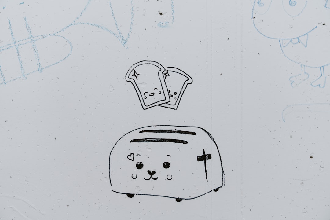
Fans love a face they can recognize! Add a cute, friendly mascot as your logo. It could be a cartoon snack, a happy dog, or a smiling lotion bottle.
This style is especially fun for pet kits, kid-themed boxes, or food subscriptions.

Pro tip: Make sure your mascot is easy to simplify. It should work in color and black-and-white.
6. The Retro Revival
Vintage-inspired logos are back! Use retro fonts, faded colors, or old-school stamps.
Great for coffee kits, barbershop boxes, or any brand that plays on nostalgia.
Try this: A badge-style logo in muted tones like mustard yellow, forest green or dusty red.
7. The Lux Lettermark
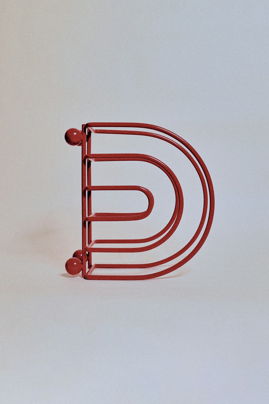
This is where initials shine. A beautiful monogram, paired with a thin serif font, screams luxury.
Perfect for skincare boxes, fashion DTCs, or premium home goods subscriptions.
Bonus idea: Use foil printing on your packaging to make your logo pop.
8. The Geometric Twist
Shaped logos can be strong and modern. Imagine triangles, diamonds, or circles in clean lines.
This fits tech gear, hobby kits, or science experiment boxes perfectly.
Make it shine: Combine bright colors with dark contrasts to grab attention.
9. The Wordplay Wizard
Sometimes, a clever name needs an even cleverer twist. Turn your brand name into the visual!
Examples: A book box called “Shelf Help” styled to look like books stacked. A cookie kit with letters shaped like icing.
Why it’s cool: It’s memorable, witty, and gets people talking.
10. The Color Pop
Stand out on the shelf—or Instagram feed. Bright colors and high contrast can make your logo pop visually.
Great for makeup kits, art boxes, and bold wellness brands.
- Use hot pink, teal, yellow or orange
- Pair with white or black text to keep it readable
Pro tip: Test your logo in both color and grayscale. It should always stand out.
11. The Stamped Seal
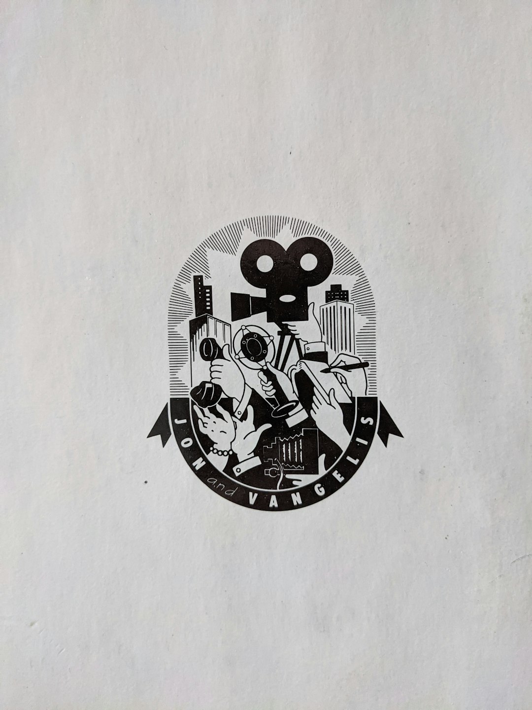
Look official. A seal-style logo (think circular badges or ribbon designs) works great for handmade or curated boxes.
They give off a “certified quality” vibe and work well with vintage or rustic fonts.
Use cases: Cheese kits, coffee boxes, handpicked goods subscriptions.
12. The Puzzle Piece
This logo style uses multi-part designs, like icons that fit together. It’s a great way to show variety or modularity.
Ideal for monthly DIY projects, STEM kits, or anything with parts to assemble.

Design tip: Each “piece” in the logo can represent something unique you offer every month.
Final Thoughts
Your logo is more than art. It’s a promise. It tells your customers what to expect—fun, wellness, tech, or trust.
Keep it simple. Make it memorable. And tailor it to your vibe. When in doubt, sketch a few ideas and ask friends what they think. You’ll be surprised which direction stands out!
Ready to launch that box? Your logo just might be the thing that gets people to click “subscribe.”
Happy designing!
