Starting a new subscription box or direct-to-consumer (DTC) kit? That’s exciting! One of the most fun — and vital — parts of branding is designing a logo that people will remember. It’s like your box’s best friend: always there, always looking good, and speaking volumes in seconds.
TL;DR
Great logos for subscription boxes and DTC kits are simple, bold, and fun. Think about your audience and product type before choosing a style. Use color, shape, and typography to make your logo stand out. Below are 12 creative ideas to inspire your own unforgettable brand mark.
1. The Minimal Mark
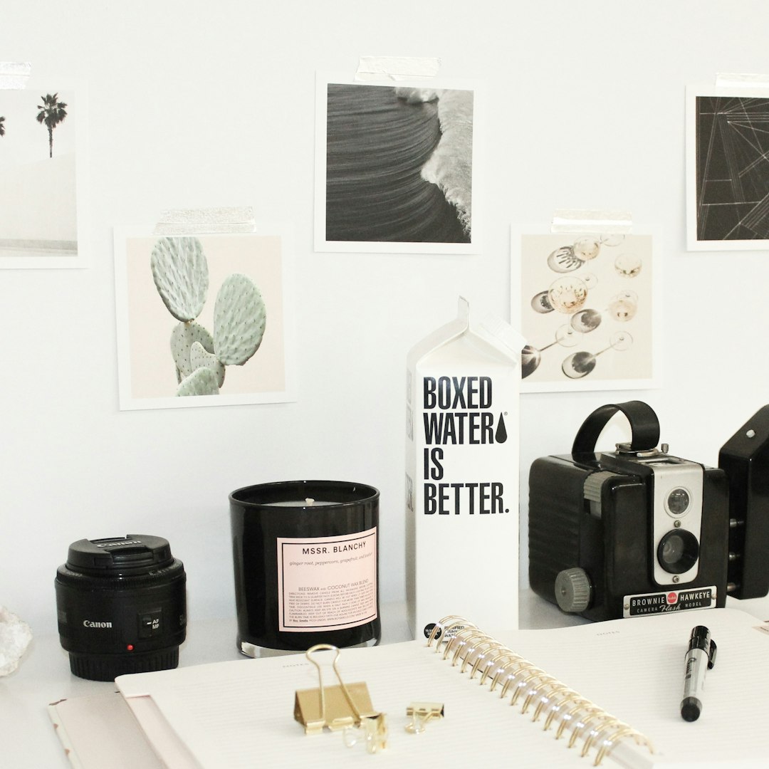
Sometimes, less is more. A clean, minimal logo feels smart, modern, and high-end. It’s especially great for beauty, wellness, or eco-friendly kits.
- Simple icon shape (leaf, droplet, star)
- Neutral palette: white, black, beige
- Thin, modern font
Want to feel extra luxe? Stick to black and white and let your product do the talking.
2. Playful Mascot
Turn a friendly face into your logo! Mascots make your brand more approachable and memorable.
- Great for kids, pets, or quirky hobbies
- Use bright colors and round, bubbly fonts
- Mascot can be a cartoon version of your product (like a smiling cookie or sunglass-wearing avocado)

3. Handwritten Vibes
Want your brand to feel personal and artisan? Go for a handwritten logo.
- Use a script or cursive-style font
- Suits food kits, DIY crafts, or anything handmade
- Add a sketch-style icon like a whisk, pen, or heart
This style tells customers: “We made this, just for you.”
4. Bold & Boxy
Make a statement! Big, bold text logos stand out — even on a crowded shelf or busy inbox.
- Use all caps sans-serif fonts
- Pick high-contrast color combos (yellow and black, red and white)
- Ideal for monthly snack packs, gadgets, or fitness kits
Strong and confident. Your brand means business.
5. Nature-Inspired Beauty
Perfect for plant-based, clean beauty, or outdoor-inspired boxes.
- Think green tones, leaves, soft type
- Add illustrated flowers, vines, or water elements
- Font should feel organic, not too perfect

This kind of logo says, “natural is beautiful.”
6. Retro Throwback
What’s old is new! Vintage logo styles are full of charm and nostalgia.
- Use retro ’70s or ’90s color palettes
- Thicker fonts with fun curves
- Add icon symbols like cassette tapes, roller skates, or neon signs
This logo idea is great for decade-themed boxes or collectibles!
7. Stencil & Stamp Style
Makes your brand feel official — almost like your box has traveled the world or come fresh from a factory.
- Circular design with boxed edges
- Stamped text or “ink faded” effect
- Perfect for coffee kits, spice boxes, or passport-themed items
8. Geometric Magic
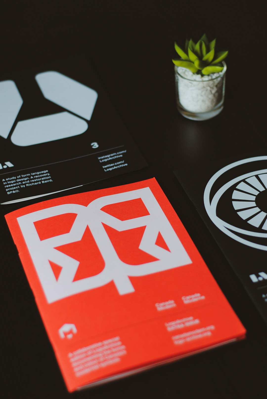
Use lines, angles, and shapes to create something eye-catching and abstract.
- Triangular or hexagon-based patterns
- Style works well for tech, education, and engineering kits
- Modern typeface, possibly monospaced or minimal
Geometry isn’t just for math lovers anymore!
9. Lettermark Fun
Sometimes one or two letters can do all the heavy lifting.
- Take your initials (like “SB” for SnackBox)
- Style them in creative ways — stacked, mirrored, interlocked
- Add color or texture, but keep it simple
Lettermarks are great for startup brands trying to build fast recognition.
10. The Icon Hero
Make one super-strong icon the center of your logo.
- This symbol will live on your box, sticker seals, and social media avatars
- Could be a rocket, a cloud, a lock — something that *feels* like your brand
- Keep fonts clean to let your icon shine
This works especially well when paired with a brand that’s all about simplicity and focus.
11. Patchwork Patterns
This style creates visual interest by mixing different textures or icons into one bold layout.
- Imagine a quilt or collage, where each shape offers a clue about your box
- Good for kits that have a variety of items every month
- Play with vibrant colors or stick to a few earth tones
Let your logo tell a story — piece by piece.
12. Typography Rules
Forget icons — make your whole brand ride on killer typography.
- Custom lettering or modified fonts
- Can be quirky, elegant, bold, or chill
- Add simple doodles like stars, moons, sparkles if needed
Sometimes just a great name, styled right, is the whole package.
How to Pick the Best Logo Idea?
Feeling overwhelmed by choices? Here are a few quick tips to help you focus:
- Know your audience: Design for the people opening the box. Are they kids, teens, adults, or pet lovers?
- Be memorable: The best logos stick in your mind after a split-second glance.
- Think versatile: Will your logo look good tiny on social icons AND big on a box?
- Keep it simple: Complicated logos become blurry messes when printed small.
Final Thoughts
Logos are more than just eye candy — they’re the first hint of the experience inside your box! Whether you go bold, cute, modern, or vintage, make sure your logo tells your story in one glance. Don’t be afraid to iterate and test a few versions. You’ll know when it “clicks.”
Happy branding — and may your boxes always be unboxed with joy!
