In the rapidly growing world of subscription boxes and direct-to-consumer (DTC) kits, first impressions matter. Among the various branding elements that shape customer perception, a logo stands at the forefront. It’s the signature of a brand—an instantly recognizable symbol that conveys identity, quality, and value. Whether it’s a monthly beauty box, a gourmet snack kit, or a bespoke craft subscription, a logo can speak volumes before the box is even opened.
TL;DR
Creating a memorable logo is key to standing out in the competitive world of subscription boxes and DTC kits. From clean minimalism to whimsical illustrations, your logo should be aligned with the personality of your brand. Focus on relevance, scalability, and emotional connection. Below are twelve logo ideas that can help spark inspiration for your next venture.
1. Minimalist Monogram
Simple yet sophisticated, a minimalist monogram is a timeless choice. Use the initials of your brand in a sleek, geometric style. Think black and white color schemes, strong lines, and negative space to keep it clean and memorable. This idea is perfect for beauty boxes or luxury grooming kits aiming for an elegant appeal.
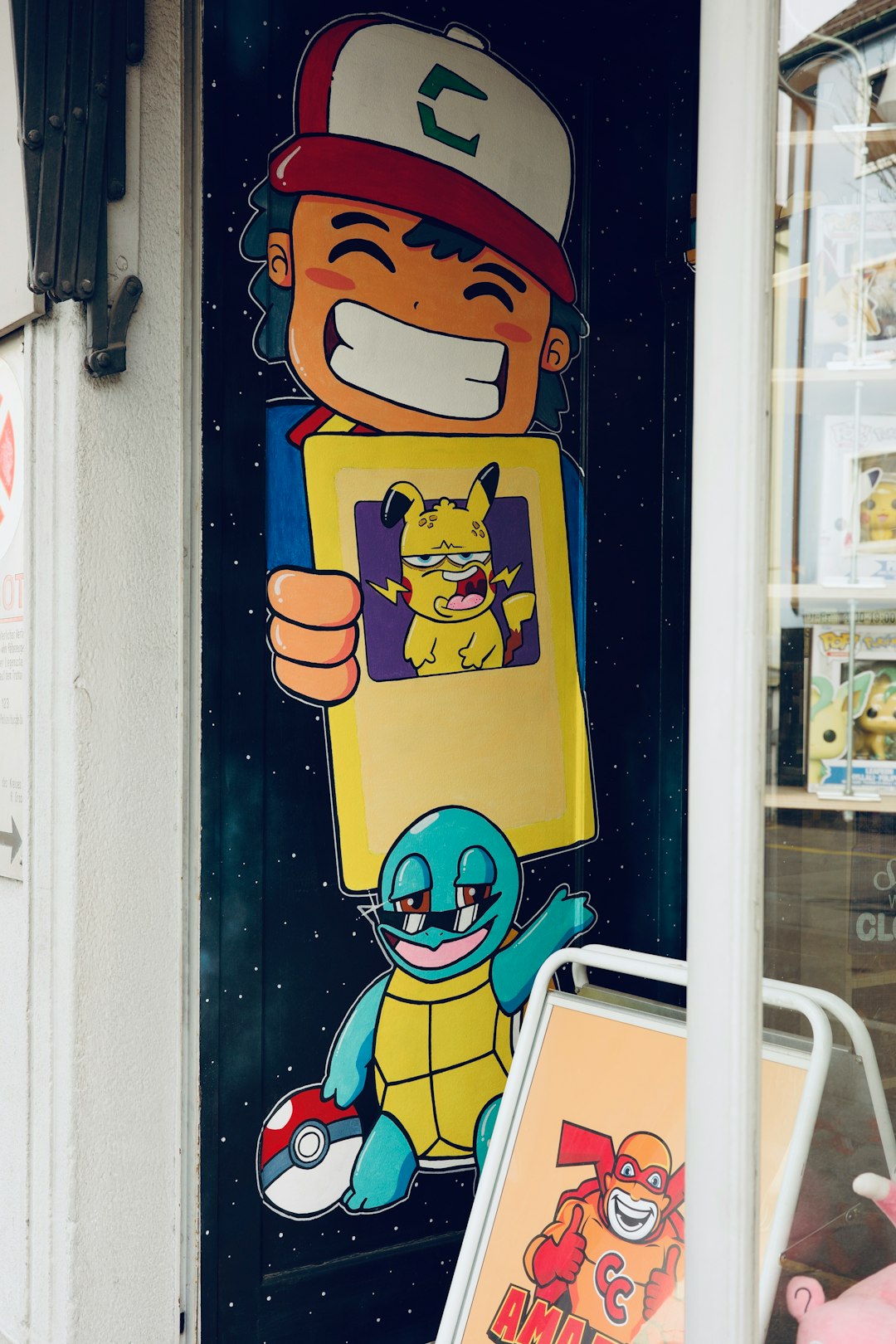
2. Playful Mascot
A friendly mascot can add a touch of personality, especially for children’s kits or pet subscription services. Cartoonish animals, cheery faces, or quirky characters help create emotional bonds with customers and make unboxing an event to look forward to.
3. Nature-Inspired Emblems
For eco-friendly or organic subscription boxes—like garden kits, herbal teas, or sustainable snacks—logos featuring leaves, mountains, or natural elements can emphasize harmony with nature. Earth-toned colors and hand-drawn styles work well here.
4. Retro Vibes
Tap into nostalgia with a vintage-style logo. Fonts that mimic typewriters, old-school packaging patterns, or badges influenced by 70s and 80s design evoke comfort and familiarity. Ideal for monthly kits containing old-fashioned treats, retro games, or classic literature.
5. Bold Lettermarks
Go big and bold with your brand initials. A lettermark logo uses minimal elements but delivers high impact—especially when paired with vibrant colors or textured backgrounds. This works well for fitness boxes or supplement kits that want to project strength and confidence.
6. Abstract Shapes
Break free from traditional iconography with unique geometric designs. Abstract logos can be deeply symbolic or simply eye-catching with no deeper meaning. Perfect for tech-forward kits, coding clubs, or digital service DTCs.
7. Subscription Stamp
Think of a postal stamp or an inked seal—this logo approach ties nicely with the concept of something being delivered regularly. Incorporate circular layouts, wavy lines, and envelope motifs to hint at movement and arrival. Excellent for stationery boxes, book clubs, and writing kits.
8. Custom Typography
A wordmark using hand-drawn or expertly crafted type can make your brand name pop. Whether it’s elegant cursive, playful bubble letters, or bold sans-serifs, custom fonts create uniqueness and are extremely brandable. Best used for fashion and beauty boxes targeting niche markets.
9. Whimsical Illustrations
Hand-drawn illustrations can give your logo a welcoming and artisanal touch. From tiny doodles to full illustrations that frame text, this style resonates well with DIY kits, art-and-craft boxes, or cooking clubs wanting to emphasize creativity and warmth.
10. Symbolic Icons
Create a logo using a single meaningful icon—like a compass for adventure boxes, a spoon for food subscriptions, or a book for literary kits. The key is clarity and recognition. A visual metaphor adds conceptual depth without overwhelming the design.
11. Modern Badges
Combining iconography with structured shapes like shields or hexagons creates a “badge” feel that can look extremely polished. These logos work well for hobby kits, home improvement boxes or tactical DTC products. They suggest reliability, craftsmanship, and pride.
12. Color-Driven Identity
Sometimes, your logo doesn’t need complex shapes—just clever use of color. Opt for gradients, dual-or-tri-tone schemes, or responsive color shifts that reflect different subscription tiers. Color psychology plays a big role in how consumers interpret subtleties in branding.
Bonus Tips for Logo Success
- Scalability: Make sure your logo looks good from a tiny mobile screen to printed packaging.
- Simplicity: Don’t overcrowd; focus on one or two core design elements.
- Consistency: Align your logo with your brand voice, box design, website, and social media presence.
- Recognition: Choose unique shapes and compositions that are easy to recall at a glance.
Trends to Watch in Logo Design for Subscription Brands
Several trends are shaping creative choices in subscription box logos:
- Adaptive logos: Variations for small screens and stickers on packaging.
- Muted color palettes: Earthy and soft tones replacing bold neons.
- Motion logos: Logos with animation for online use in unboxing videos and apps.
Where and How to Use Your Logo
Your logo should be featured across key brand real estate:
- Your box’s outer and inner packaging
- Subscription inserts or thank-you cards
- Your website and checkout experience
- Branded merchandise or loyalty gifts
- Social media avatars and video thumbnails
Unboxing has become a content format in itself, so logos need to resonate well not only in person but also on camera. A wisely designed logo boosts shareability and helps build community around your product.

FAQ
1. What makes a good subscription box logo?
A good logo should be scalable, relevant, and visually distinct. It should match the tone of your subscription offering and be clear at any size—from web icons to printed boxes.
2. How many colors should my logo have?
Most successful logos use no more than 2–3 colors. This ensures versatility and optimal printing costs. You can always create monochrome or single-color variants for different use cases.
3. Should I hire a professional designer?
If budget allows, hiring a professional can bring fresh perspective and polish. However, if you are just starting out, using design platforms with templates or AI-powered logo tools can help create a quick and efficient placeholder logo.
4. What file formats should I request?
Always ask for vector files like SVG or AI for scaling purposes, as well as PNG versions with transparent backgrounds.
5. How often should I update my logo?
You don’t need to update a well-designed logo often. Many brands do minor tweaks or refinements every 5–10 years, depending on changing trends or product pivots.
In summary, your logo is one of your brand’s most powerful tools. It can capture attention, inspire trust, and build loyalty over every delivery cycle. Whether you go minimalist or maximalist, remember that the best logos tell a story—and they make your customers want to be part of it.