Nestled in the heart of a small town, Sweet Crumbs Bakery had been serving warm pastries, artisan breads, and sugary delights for over a decade. Though the bakery had a loyal local following, the owners realized they needed to modernize their image to attract new customers and increase brand recognition. Their solution? A simple logo redesign, creatively guided by the psychology of color.
TLDR:
The owners of Sweet Crumbs Bakery harnessed the power of color psychology to redesign their logo. They followed a step-by-step process involving research, expert consultation, and trials that led to a bright, inviting new identity. As a result, the bakery saw an uptick in foot traffic, social media followers, and customer recall. The strategic use of color enhanced the brand’s emotional connection with its audience.
Why Color Psychology Matters for Branding
Color isn’t just decorative—it’s deeply symbolic and can influence customer behavior. Studies show that up to 90% of judgments made about a brand or product are based on color alone. For bakeries and other food businesses, this makes color an essential tool in eliciting appetite, warmth, trust, and overall brand appeal.
When Sweet Crumbs Bakery decided to update their outdated logo, they didn’t just look for something trendy. They aimed for colors that resonated emotionally with their target demographic: families, foodies, and casual customers looking for comfort food and an inviting atmosphere.
The Problem With the Old Logo
Sweet Crumbs’ previous logo featured a muted brown palette with serif text and minimal graphics. While functional, it lacked vibrance and uniqueness. Worse, customers often confused the brand with a chain coffee shop or mistook it for a wholesale bread supplier.
This lack of distinctiveness prompted the owners, Claire and Leo, to revisit their branding and dive into color psychology to redefine their bakery’s aesthetic.
Step-by-Step Process to a Visually Striking Logo
The bakery’s rebranding wasn’t an impulsive change. It involved a detailed, seven-step process that allowed them to understand the meaning behind colors and make design decisions based on science and emotion—rather than chance.
1. Defining Core Brand Values
Claire and Leo started with introspection. Instead of jumping into visuals, they asked:
- What do we want our bakery to feel like?
- What emotions should customers associate with us?
- What makes us unique?
They defined warmth, nostalgia, and joy as their key values, guiding every design element that followed.
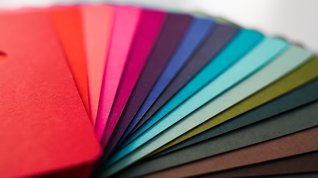
2. Researching Color Psychology
The duo read articles and consulted design experts to learn how colors influence human behavior. Here’s what they discovered:
- Red: Stimulates appetite and emotion but can feel intense.
- Yellow: Communicates happiness and warmth.
- Brown: Earthy and traditional, but not very attention-grabbing.
- Pink: Evokes sweetness and nostalgia, especially in the context of baked goods.
- Cream/Beige: Offers a classy, soft background that pairs well with brighter tones.
Based on this, they decided to move away from heavy browns and embrace warmer, more vivid tones.
3. Creating Color Palettes
Working with a freelance graphic designer, they developed three mood boards, each with distinct color themes:
- Honeycomb Harvest: Soft yellows, caramel, and cream tones.
- Retro Strawberry: Baby pink, cherry red, and pastel green.
- Sunrise Delight: Orange, warm gold, with hints of creamy white.
Each palette came with font pairings and logo variations for visual context.
4. Selecting the Final Color Theme
They carried out a survey with over 100 customers, using printed samples and social media polls. The “Retro Strawberry” theme won decisively. Customers said the pink-red combination felt “sweet, fun, and inviting”—exactly the vibe they wanted.
5. Designing the New Logo
The final logo featured a hand-drawn cupcake in pink and red hues with a swirled cherry heart on top. The font was updated to a modern, playful sans-serif type that still had a touch of vintage charm. The layout was circular—easy to use on packaging, signage, and social media.
Image not found in postmeta6. Updating Brand Assets
Once the logo was finalized, the bakery rolled it out across all branding materials, including:
- Pastry boxes and paper bags
- Outdoor signage and uniforms
- The website and social media profiles
- Merchandise like mugs and tote bags
Consistency was key—they ensured that every touchpoint reflected their new visual identity.
7. Measuring the Results
Within six months of launching the new logo, Sweet Crumbs Bakery tracked notable results:
- 25% increase in brand recall during customer surveys
- 40% jump in new social media followers
- 15% rise in foot traffic attributed to improved signage
- Increased merchandise sales using the new logo on products
The color and design changes didn’t just look good—they worked.
Conclusion
Sweet Crumbs Bakery’s journey shows how even small businesses can leverage color psychology to create a brand identity that connects emotionally and visually with their audience. By following a systematic process—from self-reflection to design testing—they turned a modest logo refresh into a strategic business move that paid off visibly and emotionally.
FAQs
-
Q: How long did the redesign take?
A: The entire process took about three months, including research, design, surveys, and rollout. -
Q: Was the redesign expensive?
A: The owners budgeted approximately $2,500 for the designer, packaging updates, and signage replacements—an investment that quickly paid off. -
Q: Did the bakery lose any loyal customers with the change?
A: Not at all. In fact, most repeat customers loved the new look and felt it better represented the bakery’s spirit. -
Q: Can other small businesses apply similar strategies?
A: Absolutely. Any service or product-based business can use color psychology to improve its visual identity and brand clarity.