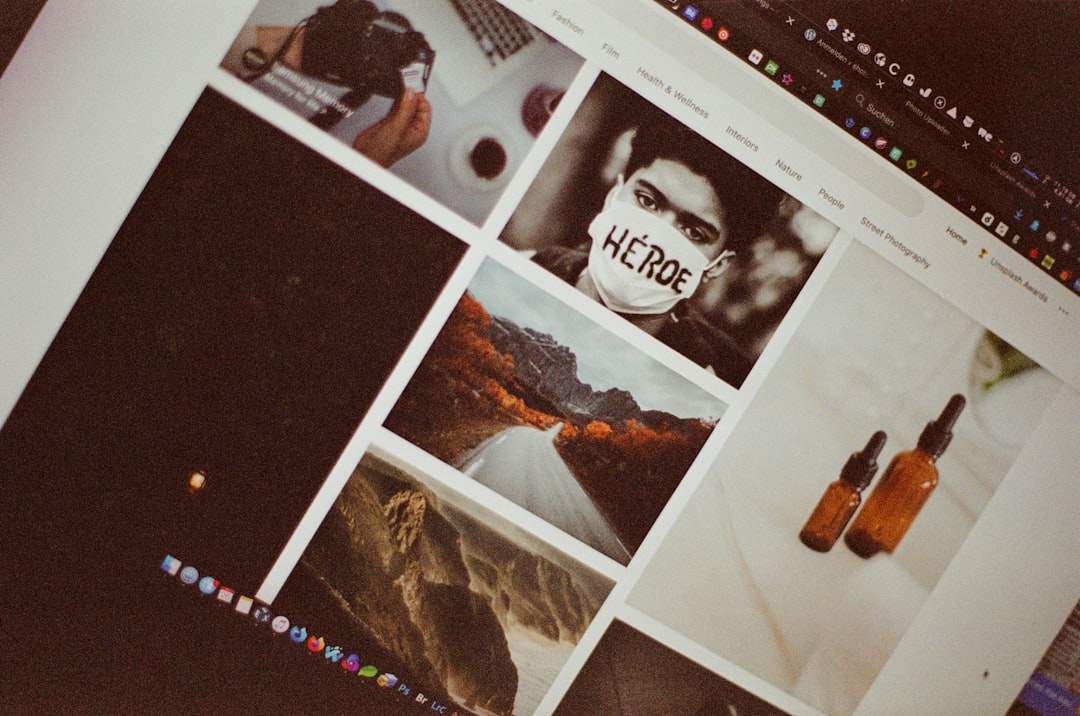
In a world saturated with digital content, visual editing has become an everyday necessity rather than a specialized skill. From social media posts and business presentations to online stores and personal blogs, people constantly need to crop, resize, retouch, and enhance images. Yet many struggle with common visual challenges such as poor lighting, awkward composition, cluttered backgrounds, or inconsistent branding. Pictures of editor interfaces, step-by-step examples, and visual demonstrations play a surprisingly powerful role in helping users understand and solve these common issues efficiently.
TLDR: Pictures of editor tools and real editing examples help users quickly understand how to fix common visual problems like bad lighting, poor cropping, and cluttered backgrounds. Visual references reduce confusion, speed up learning, and make editing techniques easier to apply in real situations. By showing before-and-after comparisons and tool placements, images guide users more effectively than text alone. For beginners and professionals alike, visual explanations turn complex editing tasks into manageable steps.
Visual editing can feel overwhelming, especially for beginners who are unfamiliar with technical terms like exposure, saturation, aspect ratio, or layer masking. Written explanations alone often leave room for confusion. However, when a picture of an editor interface highlights the exact button to press or slider to adjust, the learning curve becomes much smaller. By seeing the layout and controls in action, users build confidence and practical knowledge simultaneously.
Understanding Cropping and Composition
One of the most common everyday editing problems is poor composition. A subject may be off-center, distracting objects may appear at the edges, or unnecessary space may reduce visual impact. Many people know their photo “doesn’t look right,” but they cannot pinpoint why.
Pictures of editor tools that demonstrate cropping grids and alignment guides make this issue easier to understand. For example, when users see the rule-of-thirds grid overlaid on an image, they immediately recognize how repositioning the subject improves balance.

Such images can visually demonstrate:
- How to activate the crop tool
- Where to drag corners to resize the frame
- How grid lines assist alignment
- The difference between before and after cropping
Instead of relying on abstract instructions, users observe direct visual comparisons. This creates a practical understanding of how small adjustments can dramatically improve an image’s overall composition.
Fixing Lighting and Color Problems
Another frequent visual challenge is poor lighting. Photos may look too dark, washed out, or tinted with unnatural colors. Beginners often hesitate to touch brightness, contrast, or white balance settings because they fear ruining the image further.
When an article or guide includes pictures of editor panels with clearly labeled sliders, the intimidation factor drops significantly. Seeing exactly how the brightness slider moves to the right to lighten an image removes uncertainty. Before-and-after comparisons are particularly powerful because they visibly prove that adjustments can enhance clarity without degrading quality.
Images that show histogram adjustments or color temperature modifications help users understand the relationship between controls and outcomes. For example:
- Increasing exposure brightens shadowed details.
- Reducing highlights prevents overexposed areas.
- Adjusting temperature corrects unnatural blue or yellow tones.
By seeing these edits applied step by step, users develop a sense of cause and effect. This visual learning process is more intuitive than reading technical explanations alone.
Removing Background Distractions
Cluttered backgrounds are a major issue in everyday photos. A great portrait can be ruined by random objects, photobombers, or messy surroundings. Many people believe removing backgrounds requires advanced design skills, but modern editing tools make this process far more accessible.
Pictures of editor features such as selection brushes, background erasers, or automatic removal buttons show how simple the task can be. Instead of visualizing how to trace around a person manually, users see a clear demonstration of how the tool isolates the subject.
These images help clarify:
- Where to select the background removal option
- How automatic detection outlines subjects
- How to refine edges for a natural look
- How to insert a new background layer
Visual examples also illustrate common mistakes, such as jagged edges or missing details. When users see both incorrect and corrected results, they understand how to refine their edits for a polished appearance.
Resizing Images for Different Platforms
Posting the wrong image dimensions is another everyday frustration. A perfectly edited image may appear stretched, cropped awkwardly, or compressed on different platforms. Social media channels, websites, and marketing materials all require specific aspect ratios and resolutions.
Pictures of editor resizing panels, complete with width and height fields, preset dimensions, and locking mechanisms, eliminate guesswork. Instead of describing aspect ratios mathematically, visual step guides demonstrate how a square image differs from a vertical or horizontal layout.
Side-by-side images are particularly helpful in this context. For example, showing how a 1:1 ratio looks compared to a 16:9 ratio immediately communicates the structural difference. Users can visually decide which format best suits their needs.
Visual demonstrations also teach users to:
- Maintain image proportions using aspect ratio locks.
- Avoid pixelation by preserving resolution.
- Optimize file size for faster uploads.
When users see these functions in action, they are more likely to apply them correctly in their own projects.
Adding Text and Graphic Elements
Many everyday editing tasks involve adding text, logos, or decorative elements. However, improper placement can make a design look cluttered or unprofessional. Text may blend into the background or appear misaligned.
Pictures of editor typography panels demonstrate font selection, size adjustment, spacing control, and alignment tools. Seeing how text boxes can be dragged, resized, and layered over images makes layout design easier to grasp.
Images showing alignment guides and spacing markers clarify how to create balanced designs. For example, they can highlight:
- Center alignment for titles
- Consistent spacing between elements
- Contrast between text and background
- Use of shadows or outlines for readability
Without these visual references, users might rely on trial and error. With them, the process becomes structured and deliberate.
Learning Through Before-and-After Comparisons
Before-and-after images are among the most effective teaching tools in visual editing. They show transformation in a way that words cannot replicate. When users compare an unedited photo with its enhanced version, the improvements become tangible.
Such comparisons reveal:
- The impact of subtle color correction
- The power of removing minor distractions
- The importance of balanced contrast
- The enhancement achieved through sharpening details
This side-by-side format builds visual literacy. Over time, users begin to recognize issues automatically and anticipate which editing tools will best address them.
Reducing Fear and Increasing Confidence
Perhaps one of the most overlooked benefits of pictures of editor tools is psychological. Many beginners hesitate to experiment because they fear irreversible mistakes. An unfamiliar interface filled with icons and sliders can appear intimidating.
Visual guides demystify the environment. When users see labeled screenshots and step-by-step visual examples, the editor transforms from a complex system into a manageable workspace. Familiarity reduces anxiety and encourages exploration.
Additionally, visuals provide reassurance. Seeing that adjustments can be undone or toggled off gives users confidence to test different settings. This sense of security fosters creativity and skill development.
Supporting Different Learning Styles
People absorb information in different ways. Some prefer written instructions, while others learn more effectively through visual demonstration. Pictures of editor tools bridge this gap by integrating text and imagery into a cohesive learning experience.
For visual learners, interface screenshots and edited examples clarify abstract concepts. For analytical learners, labeled visuals reinforce structured, step-by-step processes. The combination ensures broader accessibility and greater understanding.
In professional environments, visual documentation is especially valuable. Teams working on shared branding or marketing campaigns can use screenshots and annotated examples to maintain consistency across projects. Clear visual references minimize miscommunication and reduce repetitive corrections.
Conclusion
Everyday visual editing problems—from poor lighting and awkward cropping to cluttered backgrounds and inconsistent layouts—are common but solvable. Pictures of editor tools and real editing examples provide clarity where words alone may fail. They simplify complex processes, promote confidence, and accelerate learning.
By combining written guidance with visual demonstrations, users gain both conceptual understanding and practical skills. Whether adjusting brightness, resizing images, or adding text overlays, the ability to see the editing process in action transforms confusion into competence. In an increasingly visual world, such visual guidance is not merely helpful—it is essential.
Frequently Asked Questions (FAQ)
1. Why are pictures of editor tools more helpful than text instructions alone?
Pictures show exactly where tools are located and how adjustments affect an image. This reduces ambiguity and speeds up understanding, especially for beginners.
2. Can beginners improve quickly by using visual editing guides?
Yes. Visual guides provide clear, step-by-step demonstrations that make complex tasks more approachable and easier to replicate.
3. What types of editing problems benefit most from visual examples?
Cropping issues, lighting corrections, background removal, resizing for platforms, and text placement are particularly easier to understand through visual examples.
4. Do before-and-after images really make a difference in learning?
Absolutely. They highlight the direct impact of adjustments, helping users recognize subtle improvements and apply similar techniques themselves.
5. Are visual editing examples helpful for professionals as well?
Yes. Professionals use annotated screenshots and visual documentation to ensure consistency, streamline workflows, and communicate clearly within teams.